Mr Strongmans
Creatine
A Bournemouth sports nutrition brand with a great product and no identity to sell it. The founders needed a brand that looks as credible as the big names beside it, and one they can carry from the shelf to their website and social.
What we delivered, and where it lives.
A clear position: premium enough to stand next to the market leaders
BrandA refreshed identity system in lime, black and white, applied consistently across every touchpoint
BrandThree brand routes explored, one taken forward
Brand"Purpose Driven" established as the brand tagline, woven through the identity and its voice
BrandThe identity applied to the 800g tub, with production-ready artwork
Application360° product renders and mockups ready for launch
Web · Social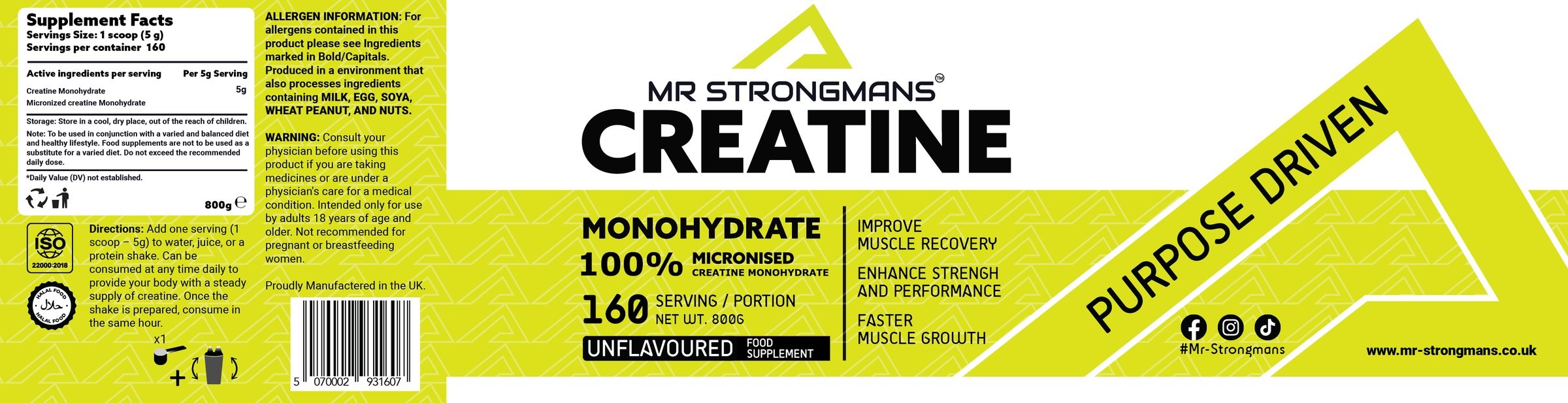
The identity on its most important touchpoint, the tub. Facts and directions on the left, the brand front and centre, "Purpose Driven" running across the right.
The brand in 3D. Turn it yourself.
Loading the tub…
Drag to turn
Drag to turn it. Switch between the final identity and the two routes we explored before choosing it.