← All work House of Dimah Start here

Genesis IX

A specialist foreign exchange fund in Gibraltar, speaking to professional investors. It had a strategy and a team. It needed a name, a look and a voice that felt as disciplined as the way it trades.
Cover of the Genesis IX visual identity guidelines: the white logo on dark navy beside a glass office tower
ClientGenesis IX
SectorFinance, private FX fund
Year2025
What we didBrand, guidelines, deck, website, print

What we delivered, and where it lives.

Brand name, positioning, tone of voice and core messaging

Brand

Logo system: symbol, wordmark, primary and secondary lockups

Brand

Colour palette with print and screen values, and how to use each one

Brand

Visual identity guidelines: colour, sizing, logo rules and iconography

Brand

Investor deck, redesigned from cover to close

Docs

Website, designed and built twice: no-code first, then hand-built in HTML and Tailwind

Web

Business cards, letterhead, a custom icon set and a LinkedIn banner

Print · Social

A mark built from a grid system.

The symbol is three blocks on a grid, the same building blocks as the layouts. It reads at favicon size and holds up on a building.
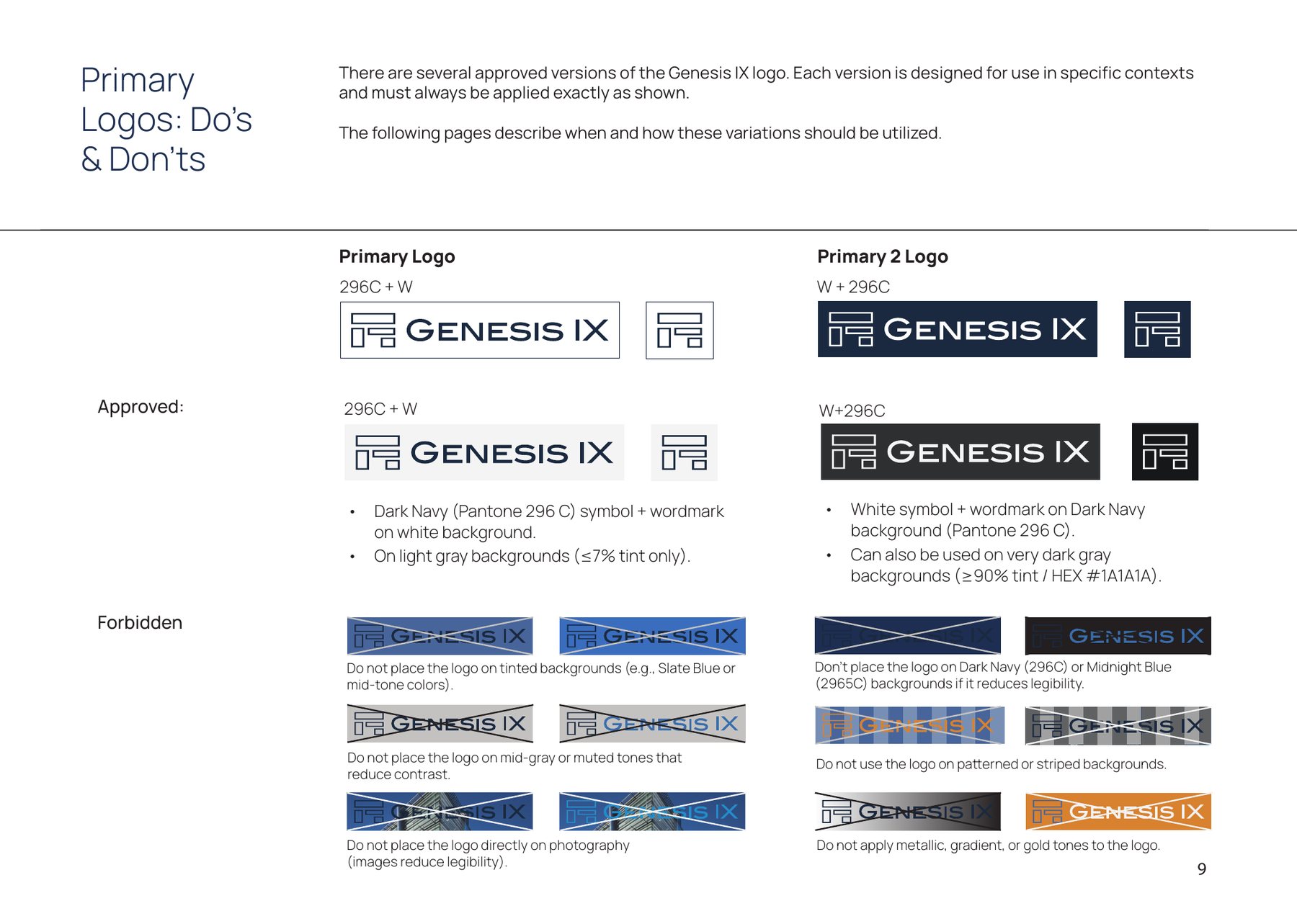
Guidelines page showing approved Genesis IX logo lockups on light and dark backgrounds, and forbidden uses
Primary lockups, and what not to do with them.
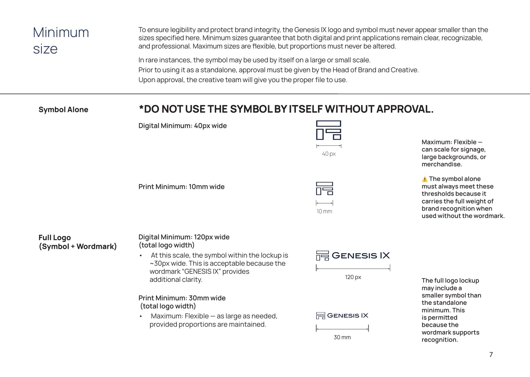
Guidelines page setting the minimum digital and print sizes for the Genesis IX symbol and full logo
Minimum sizes for screen and print, so the mark never breaks down.

Navy to lead, orange to point.

A palette that says trust and stability. Navy carries the brand. Orange is kept for the one thing you should press.

Dark Navy#112B44Pantone 296 C · backgrounds, headers, hero sections
Midnight Blue#172F55Pantone 2965 C
Slate Blue#486A97Pantone 652 C
Ocean Mist#7B92B2Pantone 652 U
Pale Silver#D3D8E2Pantone 427 C
Rich Black#0A0A0APantone Black 6 C
Muted Orange#E3773APantone 7579 C · the one thing to press

Carried into every room.

The same blocks, colours and type run through the investor deck, the cards and the fund's LinkedIn page.
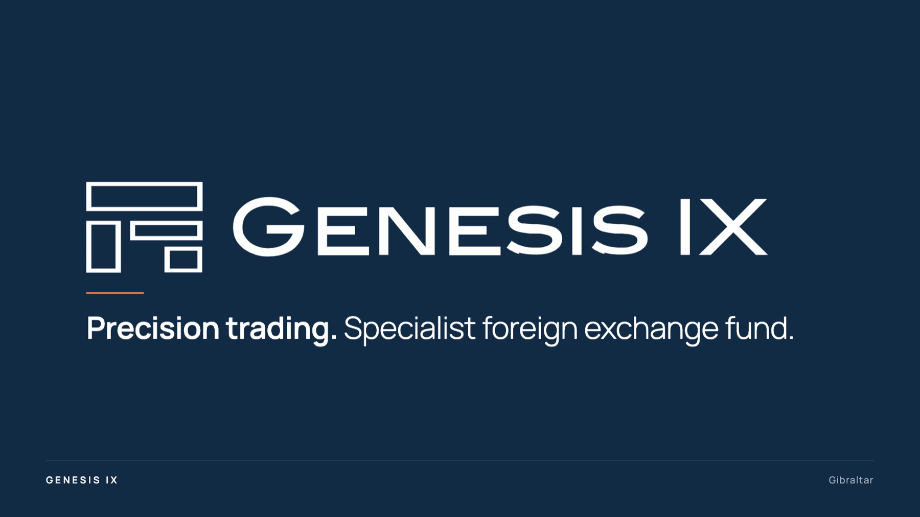
Genesis IX investor deck cover: the white logo on Dark Navy with the line Precision trading. Specialist foreign exchange fund, set in Manrope with a short orange rule
The investor deck cover, in the guideline navy and type.
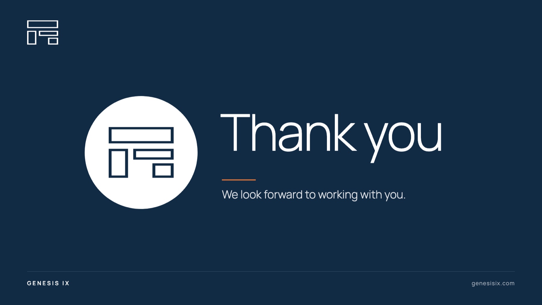
Genesis IX investor deck closing slide: the navy symbol in a white circle beside the words Thank you, set in Manrope on Dark Navy
And its end.
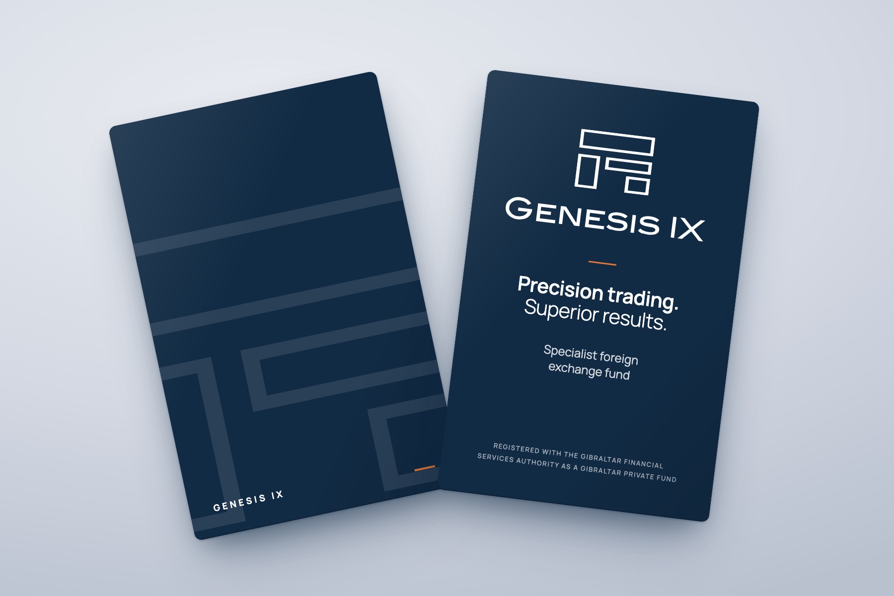
Mock-up of two Genesis IX business cards on a pale grey surface: the front with the white symbol and wordmark, Precision trading. Superior results., set in Manrope, and the back with a large faint symbol and a small orange tab
The business cards, front and back.
A custom line icon set, drawn to match the weight of the logo.
Genesis IX LinkedIn banner: Precision Trading, Superior Results, over a dark city skyline at night with the logo on the right

The LinkedIn banner.

A website with exclusive access.
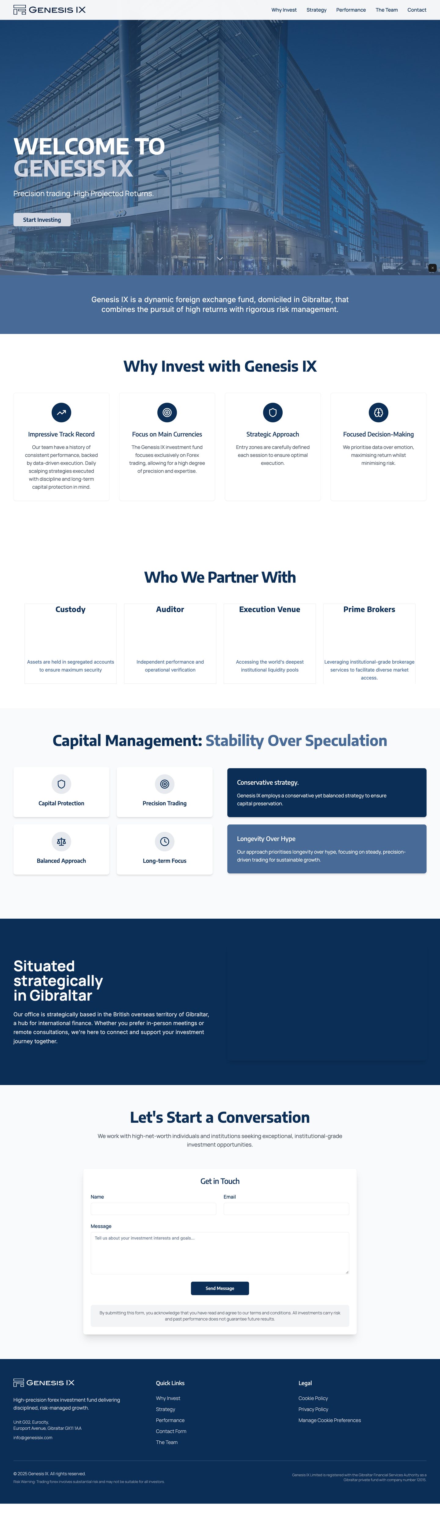
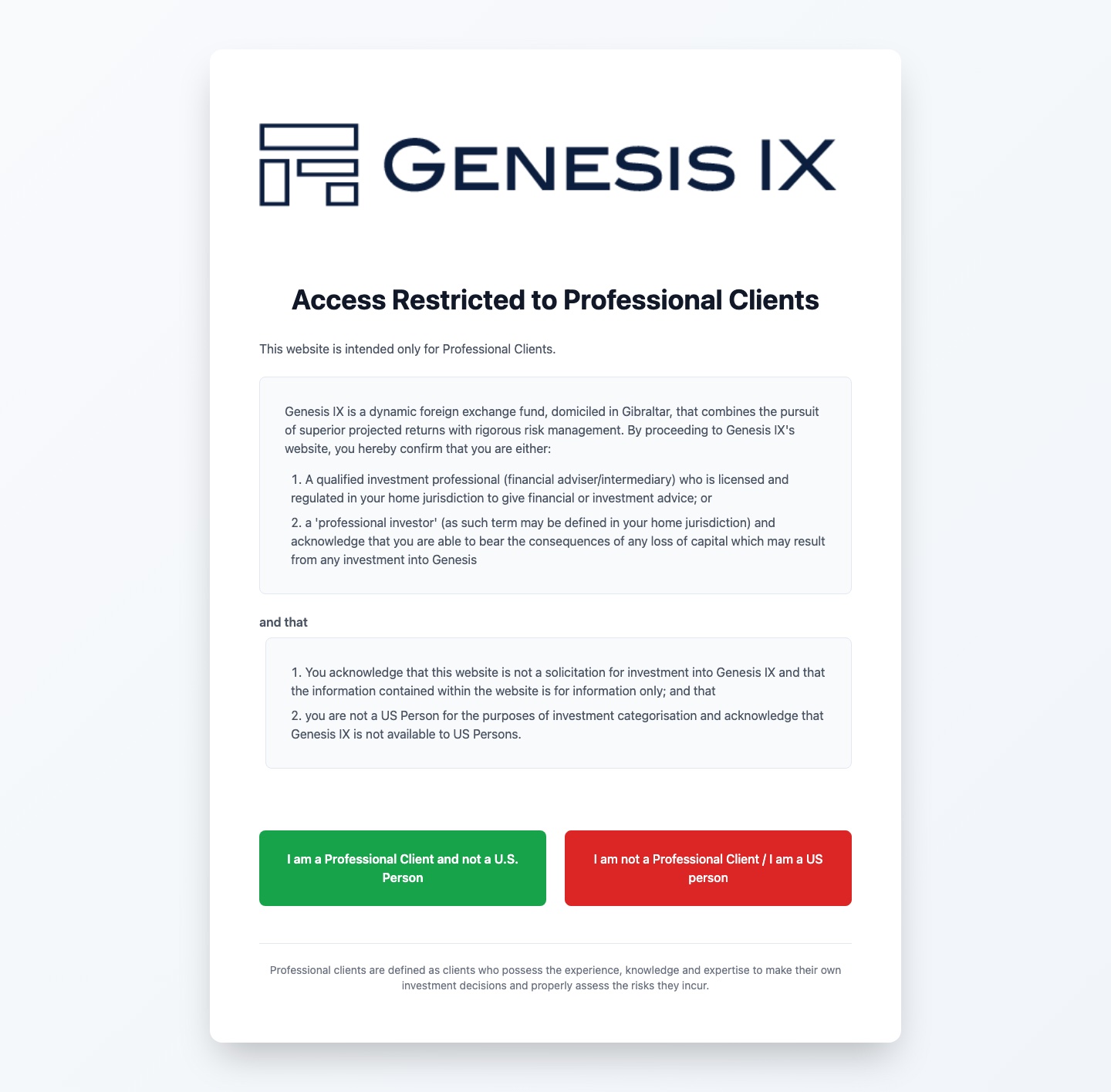
The Genesis IX homepage, scrolling slowly from top to bottom: Welcome to Genesis IX over a glass office building, Why Invest with Genesis IX, Who We Partner With, Capital Management, Situated strategically in Gibraltar, a contact form and the navy footerThe Genesis IX compliance gate: Access Restricted to Professional Clients, with a green button to confirm you are a professional client and a red button to leave

The site is for professional investors only, so it opens with a compliance gate before anything else. Behind it, the job was to bring clarity: who the fund is, how it works and how to get in touch.

We built it twice. A no-code version first, to get the fund live quickly. Then a hand-built version in HTML and Tailwind, faster and fully in our control.

First the professional-investor gate, then the live homepage behind it. Hover to pause. Fund figures and partner logos are left out.

High-impact work
deserves a brand to match.
Let’s build yours.

Start here